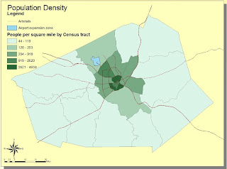
Exercise #1 and #4
Exercise #2
Exercise #3
Final Layout
On my experience using ArcMap as well as the potential, and pitfalls of GIS.
When beginning this week’s lab I felt overwhelmed by the many options available to the user. Meaning that without a detailed guide I do not believe I would have been able to complete this assignment in a timely fashion. However, after doing the tutorial it was found that most tabs were relatively well symbolized which made it easier when attempting the tutorial for a second and third time. I found it exciting to finally apply what we had only talked about in lecture. This lab finally made me realize how powerful of a tool GIS can be when used correctly. Even though this lab only revealed the basics of GIS, I was still able to explore the data that was given to us. From this data I was able to create graphs as well as maps. The software also made it very easy to deal with different layers of data. A particular data layer could be brought to the surface simply by adjusting its position in the table of contents. Also the names of specific layers could be altered easily in the table of contents and they would update automatically in the legend of their respective map with no user input.
Overall this software is very user friendly and has many features built in other than simply displaying information from the geodatabase on a map. It has the capability of allowing one to place multiple maps, each containing many layers, onto one layout. This layout can then be printed in a variety of sizes depending on printer capability. Also built into the software are tools that allow the user to add headings and change the color schemes. These are very useful tools that can help one with creating a presentation. I took full advantage of these tools and produced a layout that is fairly different from the one provided at the end of the tutorial. I added a background color to the entire layout, changed many of the colors within each map, and changed the style of north arrow, and scale bar. Another thing that is different about my map is that the bar graph has 3-D bars that have a black outline so that the viewer can clearly see them. The final difference is that in order to make the proposed airport expansion zone clearer I created a new data frame and placed it inside, and labeled it accordingly. If I were presenting this information I would use this graphic to clarify if there were any confusion.
The one pitfall that I encountered when using this software was that when it asked you to find how to find number of parcels of land use within the noise contour as well as the total area of each type. When you found the area it did not tell you if the area it was presenting was just the area within the noise contour or if it included the area of the entire parcel even if only a small portion of that parcel was touching the contour. This could potentially be a major issue if this data was actually being used. If there is one small section of an extremely large farm that is within the noise contour and the entire area of that lot is used then the data will be highly skewed and thus will yield inaccurate results.
The potential applications of GIS’ are varied and diverse; useful for any application requiring spatial or geographical components. GIS can be used to store, analyze and present geographically referenced data. To see its potential one only has to look at some of its possible uses. For example predicting areas of high risk by combining census data and weather information to identify hurricane flood zones, a business can map out it sales geographically to capture a niche market or eliminate geographic areas with poor sales, or one can map the number of physicians per 1000 people to determine which geographic locations have adequate medical facilities and identify areas to attract new physicians. As the geodatabase is expanded, relating data in new and interesting ways is only limited one’s imagination. As I will discuss shortly this is also one of the pitfalls of GIS.
A pitfall of GIS is that it will always have issues with accuracy and precision because it is an abstraction of reality. This means that all entities are represented by geometric interpretations of them. These geometries include points, lines, and polygons which inherently make simplifications of reality. It becomes especially difficult to represent reality when trying to fully represent entities that are constantly changing. Examples of this are lakes or swamp land.
Another pitfall of GIS is that the data that is collected to be input into the geodatabase can potentially have errors in it. This could be due to a careless geographer collecting faulty data. These errors could also come about from faulty or inadequate methods and tools. Though the data is rigorously checked I’m sure that some of the errors make their way into the geodatabase. Also even if the data that gets entered in is correct there are still ways in which the user can again cause problems. These problems are allowed to occur because data interpretation is still in the hands of the user.
GIS is a powerful tool that when used correctly can produce very powerful results, however, in the wrong hands it can be used to produce results that are biased. Because GIS is very reputable, people are not as likely to question the results as they would be if the same results were presented using Neogeography.
http://www.gisinarchaeology.com/gis_pitfalls.php
http://info.med.yale.edu/eph/ycphp/newsletters/GIS_and_Preparedness.pdf
http://www.kralidis.ca/gis/project/GISmeta/
http://gis.com/content/what-can-you-do-gis


No comments:
Post a Comment