Thursday, June 9, 2011

Lab 8

Figure 1: Reference Map (Los Angeles County)

Figure 2: Thematic Map (Cities and Hydrology)

Figure 3: Aspect of study area

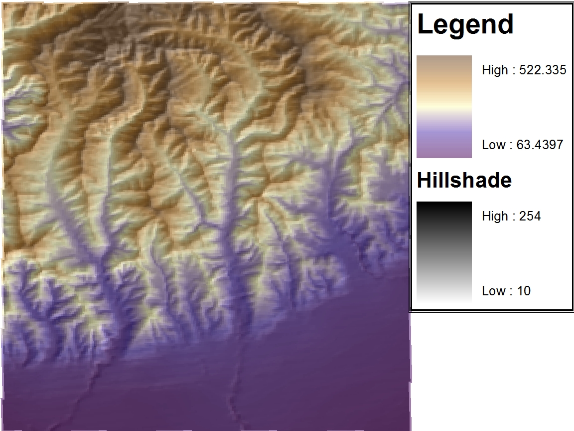
The first map is a reference map that shows the relative location of the area affected by the fire. It also shows the extent of the fire on the final day. The area shown is the largest that could be successfully downloaded from the USGS website. This is because anything more was over the allotted 1500 MB. If it was possible to download more content, I would have chosen to portray the location of the fire as a small polygon within the State of California. The second map is thematic map that shows cities and lake locations relative to the spread of the fire. Finally the third map shows the aspect of terrain around the area being examined.


During the year 2009 there were a total of 63 fires in California, burning a total of 336,020 acres. The worst of these was the “Station Fire” which accounted for over half of the total acres at 160,577 acres. This fire began on August 26th 2009 and the perimeter was not completely contained until October 16th 2009. This is an average of over 3000 acres per day, which is more than most fires burn during their entire existence.

As is shown on the reference map, figure one, this fire is located in the hills above Los Angeles. There are three aspects that will be discussed in the following paragraphs. These are location of lakes, locations of cities, and slope of mountains with respect to fire spread. Before the spatial analysis was performed it was hypothesized that one would observe the most fire spread in the direction away from both cities and lakes.

First, it needs to be noted that the nearest lakes are located south of the location of the origin of the fire. Thus, one would expect the fire to propagate further to the north. These are the expected results because one would expect that the areas that are closer to the lakes would get doused with water more often than those locations further away from them. When looking at the second figure it is clear that this is what has happened. The yellow polygon located in figure two represents an area in which the fire originated. One can clearly see that there are three lakes located relatively close to this location. Based at the legend presented at the bottom of the map, one can see that as time progressed so did the extent of the fire. Over a four day period the fire propagated nearly twenty-five kilometers outward, toward the north. This occurred between 5 degrees and 165 degrees as is portrayed in figure two. One of the main criticisms of the fire department was that they did not begin using water soon enough, which allowed the fire to become too large to control (Saillant).

Next, it was noted that the fire originated above a large density of cities. One would expect that the fire department would do everything possible to keep the fire from going towards the heavily populated areas. The reason one would desire to keep the fire from cities is to protect homes as well as lives. It can be seen from figure two, the thematic map, that the fire was forced away from major cities and highways into the mountains. This ended up destroying much more land, however, there were only 2 lives lost during the fire. In addition to this there were also 22 injuries (Station fire).

Examining figure three it becomes clear that once the fire made it over the top of the mountain, closest to the point of origin, the expansion of the fire increased exponentially. And because the fire was off the roads, in very rugged terrain, it made it impossible to stop. This is why when one examines figures one and two simultaneously it can be seen that the day after the fire makes it over the ridge there is the most growth area that the fire has engulfed. It is actually very interesting to compare the aspect map to the fire propagation map. This is because when examining them side by side it can be seen that the fire gets trapped between the ridges of the mountains. When examining how the fire spread on different days it seemed as if the fire fighters conceded the entire valley and set up “defenses” on the ridges, however, this is merely speculation.

The hypothesis was proved correct. It was shown that the fire was indeed “lead” away from the populated areas. It was also fended off by the lakes and was allowed to traverse the mountain. These combined saved many lives, however, much vegitation was destroyed. Finally, based on the amount of growth each day along with the fires position on those days, it was discovered that the fire spread faster as it went into the valley. This may be due a number of factors that include: wind through the canyon, vegetation, lack of population, and lack of accessibility. It did seem that the fire was stopped at the top of each of the ridges which leads one to believe that the fire men may have dug trenches or set up “controlled burns” in order to stop the fires here.

Citations

"Census Cartographic Boundary Files." Los Angeles County GIS Data Portal.County of Los Angeles, 011. Web. 08 June 2011. http://egis3.lacounty.gov/dataportal/?p=1048.

Martin, Mark. "Station Fire Burn Area: Two Years Later." Los Angeles Times, 14 Apr. 2011. Web. 07 June 2011. http://framework.latimes.com/2011/04/14/station-fire-burn-area/#/0.

Nester, Irene. "The Station Wildfire." Burn Severity Map of the 2009 Station Wildfire in Southern California. Emporia State University, 10 Dec. 2009. Web. 7 June 2011. http://www.emporia.edu/earthsci/student/nester4/fire.html.

Saillant, Catherine. "Delays on Additions to Forest Service's Firefighting Fleet Unacceptable, Sen. Dianne Feinstein Says." Los Angeles Times, 21 May 2011. Web. 07 June 2011.
http://www.latimes.com/news/local/la-me-station-fire-20110521,0,7290556.story.

“Station Fire.” InciWeb the Incident Information System. 10 Nov. 2009. Web. 07 June 2011.
http://www.inciweb.org/incident/1856/.

“The National Map Seamless Server Viewer." USGS. Seamless Data. U.S. Geological Survey, 28 Dec. 2010. Web. 08 June 2011. http://seamless.usgs.gov/website/seamless/viewer.htm.

Thursday, May 26, 2011

Lab 7


In this lab we were asked to plot the percentage of a specific race in each county of the continental United States.

In the first map one can see the percent of the population that is “Pure Black” in each county. “Pure Black” means that these are people that are purely African American. People who are purely black are considered to not be mixed with any other race. This map uses red to represent higher percentages of African Americans in each county and blue to represent lower ones. This allows one to distinguish areas of low population density from those of high population density and to draw conclusions about where a particular race tends to inhabit. From the map it is clear that the largest percentages of African Americans are located in the south east states. This map shows exactly what one would expect. It shows that there are still a fair amount of African Americans in the south, however, it shows that many who were driven out by racism and lack of economic opportunity have migrated toward Chicago and New York in search of a better life.

The second map shows the population of “Pure Asians” in each county. Again “Pure Asian” means those that are mixed with any other race. In this map yellow represents counties with a low percentage of Asians, while the darker colors, up to blue, represent areas of a “high” Asian population density. This map shows that the Asian population spread out much more than did African Americans. I say this because there are many more dark spots located throughout the united states than there were in the “pure black” map. This map also shows the highest concentration of Asians are located along the west coast counties. This again is exactly what one would expect to find because immigrants coming from Asia would have ended up on the west coast.

The third category shows the populations of “Other” races in each county. This is very ambiguous and feels completely pointless. Green represents counties of low population density while dark blue represents areas of high percentage of “other” races in that county. The map show us that “other” races have immigrated mainly to the southwest states. These include California, Arizona, New Mexico and Texas. If I were to offer a guess, I would assume that these immigrants are mostly from Mexico. There are also several blue spots located in Washington/Idaho/Montana and one is located in Nevada/Idaho. These are points that I am unclear of and thus if this map were being used for something of importance this would have to be looked into.

It is interesting to note that there is a huge discrepancy in what constitutes a “high” race population density between all three maps. This is very misleading at first glance. I say this because when one examines the legends for each map one discovers that the “pure black” legend goes all the way up to 86% while the “Pure Asian” legend only goes up to 46% county population. The “other” category is limited even further, down to 39% for the highest population density per county.

Monday, May 16, 2011

DEMs in ArcGIS

The location selected was the Santa Monica Mountains. This was chosen because it has many differing elevations. This will produce more interesting plots than if the plains of Africa. Another reason this location was chosen was because during the lab section I was unable to download any other in geographical information. This occurred because there were too many students attempting to do the same thing. If I were to redo this assignment I would probably choose the Grand Canyon or somewhere else with a more abrupt elevation change.

The extent information (in decimal degrees) is presented below:
Top: 34.3408
Left: -119.2356
Right: -119.1696
Bottom: 34.2728

The geographic coordinate system that was used for the original DEM was North American Datum of 1983

Shade Relief Model

Hillshade
This is not required for this lab, however, this figure helps one understand the Shade Relief Model.

Slope

Aspect

3-D Representation

Wednesday, May 11, 2011

Lab 5: Map Projections

Distance at equator: 24,781 miles
North Most: 8,310 miles
South Most: 8,321 miles:
GCS_WGS_1984 has no distortion because everything is based on longitude and latitude: The distance between Washington, D.C. and Kabul was found to be 6,935 miles.

Conformal

Mercator projection: The distance between Washington, D.C. and Kabul was found to be 10,164 miles.


Gall Stereographic: The distance between Washington, D.C. and Kabul was found to be 7,166 miles.


Equidistant

Equidistant Conic: The distance between Washington, D.C. and Kabul was found to be 6,975 miles.


Equidistant Cylindrical: The distance between Washington, D.C. and Kabul was found to be 5,074 miles.


Equal Area

Bonne: The distance between Washington, D.C. and Kabul was found to be 6,706 miles.


Cylindrical Equal Area: The distance between Washington, D.C. and Kabul was found to be 10,695 miles.

The total layout


When a map of our round Earth is required, the most accurate representation is a three dimensional globe. However, a globe doesn’t always provide all the functionality needed in a map. It is therefore useful to be able to translate, or project, the Earth onto a flat surface like paper or digitally on a computer screen. Map projections are used to project the round Earth onto a flat surface. There are a variety of map projection types to choose from and which you choose depends on what parameters need to be the most accurate or to minimize distortion in a particular way. Examples of some parameters are distance, direction, shape, and area ratio. Three types of map projections will be discussed in the following paragraphs; these include Conformal, Equidistant, and Equal area map projections

A conformal projection maintains angular relationships and accurate shapes over small areas. It is used where angular relationships are important like with navigational or meteorological charts. The conformal maps that I chose to show are the Mercator and the Gall stereographic projections.. The sizes of areas are distorted on conformal maps even though shapes of small areas are shown correctly. A Mercator projection has straight rhumb lines, lines crossing all meridians of longitude at the same angle, which enables one to easily determine compass courses for marine navigation. Gall's stereographic cylindrical projection results from projecting the earth's surface from the equator onto a secant cylinder intersected by the globe at 45 degrees north and 45 degrees south. This projection moderately distorts distance, shape, direction, and area.

An equal area or equivalent projection maintains accurate relative sizes and is used where showing area accurately is important. Shapes are more or less distorted on every equal-area map. The equal area projections I chose to show are the Bonne and Cylindrical Equal Area Projections. The Bonne projection, shaped like a heart, is a pseudo-conical equal-area map projection that applies the true scale along the parallels of the Sinusoidal to the parallels of the Simple conic. It is used in atlases for equal-area maps.

An equidistant projection maintains accurate distances from the center of the projection or along given lines. It is used for radio and seismic mapping and for navigation. The equidistant map projections I chose to create are the Equidistant Cylindrical and Equidistant Conic projection. On an equidistant conic map, distances are true only along all meridians and along one or two standard parallels. Directions, shapes and areas are reasonably accurate, but distortion increases away from standard parallels.

Now that the different map projections have been discussed, without bias, their significance can now be fully explained. As has been explained in the above paragraphs every map projection has its own distortions. It is up to the creator and/or user of the map to decide which projection is best suited for a specific application. The example given in class was that if one wants to launch a missile from a given location, one should use an equidistant map with its center located at the launch site. This is because equidistant maps only preserve distance from a specific point to any point on the map, and not between two arbitrarily chosen points. If one were to choose a different type of map projection they would almost certainly not hit their target.

When studying the distance results one must not take the distances at face value. This is because if one were to use a map based on these result, they would be very disappointed. Based on the results the conic equidistant is the “best” at preserving the distance between it is the closest to the actual distance as was found from GCS_WGS_1984. However, this is very misleading because this map is not supposed to preserve the distance between these two locations because it is not centered about either one. Also the Bonne and Gall stereographic projections are fairly close to the actual distance, however, because of the distortions present they are still slightly off of the actual distance.

Also when looking at the maps one has to realize that many of them do not maintain correct area ratios. One of the worst is the Mercator projection. It distorts the poles so much that if someone who had never seen a map was told that this was what the world looked like they would get a very incorrect representation. So as has been said before, it is necessary to use these map projections as they are meant to be used.

In conclusion, there are an infinite number map projections that can be created and each comes with its own distortions. Map projections can be a very powerful tool but it is up to the user to choose the correct projection for their specific task. One may desire to use the map for navigation, distance, or representation. If one desired to it for navigation, or for any other purpose in which it was necessary to maintain the correct angular relationships then they would choose a conformal map projection. This map type is not concerned with preserving the distance or area. Two examples of this are the Mercator and Gall stereographic projections. If one was more concerned with preserving the distance from a point one should choose to use the equidistant map projection. The examples presented in this “report” are the Equidistant Conic, and Equidistant Cylindrical. In these maps it is not important to preserve the area or angular relationship. Finally if one wishes to keep the area ratio the same one should use an equal area map projection. This allows one to maintain proportionality and create maps that correctly portray the world. However, these maps should not be used for navigation or measuring purposes as they do not preserve angular or spatial relations. The examples presented are the Bonne and Cylindrical equal area map projections.

http://www.progonos.com/furuti/MapProj/Dither/CartProp/cartProp.html
http://egsc.usgs.gov/isb/pubs/MapProjections/projections.html
http://www.nationalatlas.gov/articles/mapping/a_projections.html
http://www.quadibloc.com/maps/mps0402.htm (Bonne)
http://www.quadibloc.com/maps/mcy0102.htm (Gall’s Stereographic)
http://www.colorado.edu/geography/gcraft/notes/mapproj/mapproj_f.html

Wednesday, May 4, 2011

Lab 4: ArcMap

Exercise #1 and #4

Exercise #2

Exercise #3

Final Layout


On my experience using ArcMap as well as the potential, and pitfalls of GIS.

When beginning this week’s lab I felt overwhelmed by the many options available to the user. Meaning that without a detailed guide I do not believe I would have been able to complete this assignment in a timely fashion. However, after doing the tutorial it was found that most tabs were relatively well symbolized which made it easier when attempting the tutorial for a second and third time. I found it exciting to finally apply what we had only talked about in lecture. This lab finally made me realize how powerful of a tool GIS can be when used correctly. Even though this lab only revealed the basics of GIS, I was still able to explore the data that was given to us. From this data I was able to create graphs as well as maps. The software also made it very easy to deal with different layers of data. A particular data layer could be brought to the surface simply by adjusting its position in the table of contents. Also the names of specific layers could be altered easily in the table of contents and they would update automatically in the legend of their respective map with no user input.

Overall this software is very user friendly and has many features built in other than simply displaying information from the geodatabase on a map. It has the capability of allowing one to place multiple maps, each containing many layers, onto one layout. This layout can then be printed in a variety of sizes depending on printer capability. Also built into the software are tools that allow the user to add headings and change the color schemes. These are very useful tools that can help one with creating a presentation. I took full advantage of these tools and produced a layout that is fairly different from the one provided at the end of the tutorial. I added a background color to the entire layout, changed many of the colors within each map, and changed the style of north arrow, and scale bar. Another thing that is different about my map is that the bar graph has 3-D bars that have a black outline so that the viewer can clearly see them. The final difference is that in order to make the proposed airport expansion zone clearer I created a new data frame and placed it inside, and labeled it accordingly. If I were presenting this information I would use this graphic to clarify if there were any confusion.

The one pitfall that I encountered when using this software was that when it asked you to find how to find number of parcels of land use within the noise contour as well as the total area of each type. When you found the area it did not tell you if the area it was presenting was just the area within the noise contour or if it included the area of the entire parcel even if only a small portion of that parcel was touching the contour. This could potentially be a major issue if this data was actually being used. If there is one small section of an extremely large farm that is within the noise contour and the entire area of that lot is used then the data will be highly skewed and thus will yield inaccurate results.

The potential applications of GIS’ are varied and diverse; useful for any application requiring spatial or geographical components. GIS can be used to store, analyze and present geographically referenced data. To see its potential one only has to look at some of its possible uses. For example predicting areas of high risk by combining census data and weather information to identify hurricane flood zones, a business can map out it sales geographically to capture a niche market or eliminate geographic areas with poor sales, or one can map the number of physicians per 1000 people to determine which geographic locations have adequate medical facilities and identify areas to attract new physicians. As the geodatabase is expanded, relating data in new and interesting ways is only limited one’s imagination. As I will discuss shortly this is also one of the pitfalls of GIS.

A pitfall of GIS is that it will always have issues with accuracy and precision because it is an abstraction of reality. This means that all entities are represented by geometric interpretations of them. These geometries include points, lines, and polygons which inherently make simplifications of reality. It becomes especially difficult to represent reality when trying to fully represent entities that are constantly changing. Examples of this are lakes or swamp land.

Another pitfall of GIS is that the data that is collected to be input into the geodatabase can potentially have errors in it. This could be due to a careless geographer collecting faulty data. These errors could also come about from faulty or inadequate methods and tools. Though the data is rigorously checked I’m sure that some of the errors make their way into the geodatabase. Also even if the data that gets entered in is correct there are still ways in which the user can again cause problems. These problems are allowed to occur because data interpretation is still in the hands of the user.

GIS is a powerful tool that when used correctly can produce very powerful results, however, in the wrong hands it can be used to produce results that are biased. Because GIS is very reputable, people are not as likely to question the results as they would be if the same results were presented using Neogeography.

http://www.gisinarchaeology.com/gis_pitfalls.php
http://info.med.yale.edu/eph/ycphp/newsletters/GIS_and_Preparedness.pdf
http://www.kralidis.ca/gis/project/GISmeta/
http://gis.com/content/what-can-you-do-gis

Thursday, April 21, 2011

Lab 3

When approaching this week’s lab it was imperative to understand the term Neogeography. According to Tuner,“Neogeography means ‘new geography’ and consists of a set of techniques and tools that fall outside the realm of traditional Geographic Information Systems.”

In essence it means that a person, who is not an expert in the field of geography, can make their own map about whatever they desire and combining it with an existing toolset. The existing toolset that was forced upon us was provided by Google maps. Therefore, all that was left was to find something that I would find useful to map. I had several ideas after first reading the lab description. The first was to map out all the ski resorts around Tahoe, however, this would not have proved to be very useful to me seeing as I am not an avid skier. After thinking about it and contemplating many other ideas I decided that the most interesting and useful map, for me, would be a map of my trip to Boston. I chose this because, for many years, I had been trying to figure out a way to map out my travels and this was the perfect starting location.

After deciding on the topic of the map it was time to get started with creating my mash-up. However, this proved to be more difficult than I had initially thought. One issue I ran into when creating this map was that the line creator was not very user friendly and would often disappear if you did not click the correct buttons. The other issue is that the icons provided by Google maps are not enough to fully illustrate my map. Therefore, many of the locations had to be symbolized by the default icon.

Rather than merely placing markers at the places I visited I decided that it would be more interesting, for both the audience and I, to include some historical background and pictures for many of the sites visited. This was done by clicking on the plain text icon to write text and by clicking the rich text icon to add pictures. Also in two locations, Fenway Park and the Ship Yard, there are videos attached. This was done by pasting the old embedded code into the html tab. I believe that adding these features will serve two purposes. The first is that it will improve the experience for someone who desires to get a tour of Boston, and the second is that these features will be useful for me in the future when I want to go back to look at my travels. This is because instead of having to look up information on these places, one can simply refer to the map which has everything conveniently located.

The map below contains place markers, Lines, and shapes. Embedded within these three items are text, pictures, and videos.


View Boston Tour in a larger map


Before the creation of Web 2.0 there was not much interaction between the site creator and the viewers of the site. This was because before the Web only allowed the users to view the contents of the sites. However, with the creation of Web 2.0, users are able interact with the sites. These advances eventually led to the use of application programing interfaces, API’s, such as my maps on Google.

Use of my maps on Google allows anyone with access to a computer to create a personalized map. There are several pitfalls of neogeography that stem from the previous statement. First anyone can create a map and disperse it on the Web without authenticating it. Meaning that we do not know the accuracy of the maps and that there most certainly is incorrect information posted for the public to see. This is in direct contrast with GIS which are created by professionals and closely monitored by reliable sources. Secondly the maps created are personalized and can cover a variety of topics. This along with the fact that there is no regulation of the information being posted means that there could potentially provide harmful information. In summary, when considering neogeography we must question the accuracy, reliability, authority, and content of the information provided.

One other pitfall neogeography is that in using a premade toolbox such my maps, on Google, the user is very limited by the constraints of the program. I ran into problems when trying to simply upload pictures to the map as well as when I was attempting to find exact symbols for every location. I encountered these issues because order to get pictures to show up on the map an online photo album must first be created. This is inefficient and is something that needs to be built into the program. Also when trying to represent the locations visited with symbols, I found myself very disappointed with the number icons available and had to settle for the default icon many times.

Despite all the pitfalls of neogeography it is actually a very powerful tool that, when used correctly, can help provide people with a limitless supply of useful information. All this information can be used to help make everyday life easier. For instance, there is a new app on the I-Phone that allows you to find parking meters that are open. Also there are websites that allow you to find the cheapest gas in a specific area or the traffic on your route home from work. The same idea can be applied to many other situations. However, neogeography can also be used the way I have used it. This is to provide my viewers with an informative tour of Boston which so happens to coincide with my travels. The bottom line is that the potential of neogeography is limitless and as technology gets better so will it.

The consequences of neogeography are that the general public has an increased geographic awareness. Also because there is input from the general public the cost of continually updating information is decreased substantially. An example of this would be if I were to input the location of a camera at a stoplight into my GPS. The GPS would then send the information directly to a member of the tom-tom GPS team that would then have to verify this and update their map accordingly. The most important consequence is we are all geographers now and we can all contribute to society by creating maps that provide everyone, including the professional goegraphers, with useful information that can make life easier.

Friday, April 15, 2011

Lab 2

James Antisdel
1.       What is the name of the quadrangle?
Beverly Hills Quadrangle
2.       What are the names of the adjacent quadrangles?
Canoga Park, Van Nuys, Burbank, Topanga, Hollywood, Venice, Inglewood
3.       When was the quadrangle first created?
1966
4.       What datum was used to create your map?
North American Datum of 1927
National geodetic vertical datum of 1929
5.       What is the scale of the map?
 1:24000
6.       At the above scale, answer the following:
For the following four questions I used the equation:
Representative fraction = map distance/ground distance
a.        5 centimeters on the map is equivalent to how many meters on the ground?
1200 meters
b.        5 inches on the map is equivalent to how many miles on the ground?
1.89394 miles
c.        one mile on the ground is equivalent to how many inches on the map?
2.64 in
d.       three kilometers on the ground is equivalent to how many centimeters on the map?
12.5 cm
7.       What is the contour interval on your map?
                20 ft
8.       What are the approximate geographic coordinates in both degrees/minutes/seconds and decimal degrees of:
a.        the Public Affairs Building;
b.       the tip of Santa Monica pier:
                         c.        the Upper Franklin Canyon Reservoir:
                            
9.       What is the approximate elevation in both feet and meters of:
a.        Greystone Mansion (in Greystone Park);
570 ft =173.7361meters
b.       Woodlawn Cemetery;
140 ft = 42.672 meters
c.        Crestwood Hills Park;
760 ft = 231.648 meters
10.    What is the UTM zone of the map?
Zone 11
11.    What are the UTM coordinates for the lower left corner of your map?
361.5 Northing = 361,500 meters
 3763 Easting = 3,763,000 meters
12.    How many square meters are contained within each cell (square) of the UTM gridlines?
10002 m2 = 1km2
13.    Obtain elevation measurements, from west to east along the UTM northing 3771000, where the eastings of the UTM grid intersect the northing. Create an elevation profile using these measurements in Excel (hint: create a line chart). Figure out how to label the elevation values to the two measurements on campus. Insert your elevation profile as a graphic in your blog.


14.    What is the magnetic declination of the map?
+140
15.  In which direction does water flow in the intermittent stream between the 405 freeway and Stone Canyon Reservoir?
South
16.   Crop out (i.e., cut and paste) UCLA from the map and include it as a graphic on your blog.


Thursday, March 31, 2011

Lab 1: Thematic Maps

“A Thematic Map shows the physical distribution of specific data for a geographic area. This style of map shows statistical information rather than topographical information Thematic Maps emphasize a single topic, theme or subject. These maps display information such as agricultural yield, soil type, temperature, climate, economy, crime rates or land ownership”.

     1.      Remote Areas of the World


This map was obtained from the following source:
http://www.newscientist.com/data/images/ns/cms/mg20227041.500/mg20227041.500-1_1000.jpg

The above map shows the time it would take for one to travel, on the ground, to a major city from anywhere in the world.  The methods of travel include roadways, railways, and river ways. From the article accompanying this map I found out that only ten percent of the land is more than 48 hours away from a major city.

Initially what struck me about this map were the colors used as well as the spider web like paths. Further investigation yielded a very interesting map that was slightly confusing.  I found it interesting that in order to fully understand what the map was telling you, it was necessary to read the article.  This is in contrast with maps I’ve seen in the past where every necessary item needed was covered directly on the map.  The useful piece of information, that was in the article yet is nowhere to be seen on the map, is that a population of 50,000 people or more constitutes a “major city”.  


2.     Total CO2 Greenhouse Gas Emissions in the year 2000, by Country


Source: http://www.clemson.edu/caah/history/FacultyPages/PamMack/lec124/rothman8.html

The above map shows the total CO2 emissions in different countries. As we can see the most CO2 produced is in the United States followed closely by china.

I found this interesting because it is one of the most controversial issues and has lead many politicians to push for “green” energy.  The issue is that CO2 “pollution” is causing the temperature of the earth to increase.  One of the studies used to “prove” that this was indeed the case yielded the following data.  This data is organized in a plot that is simply called “the hockey stick graph”.


Source: http://www.greatdreams.com/climate/gore_u_n.htm

This graph has many flaws.  The major one is that it completely ignores the medieval warm period.  These temperatures were even higher than current day temperatures. As it is true that true that temperatures had been increasing over the period of about a decade temperature measurements over the past few years have shown that the temperature has actually plateaued and is even decreasing slightly. The reason for this is not that we have suddenly become more “green” as it’s been seen that during the past few years the CO2 levels continue to increase.  This concerns many people whose research depends on there being a crisis.


3.     Where has the internet been censored?


The above map shows the countries where the internet is censored.  There are a total of 15 countries that restrict the internet. These countries are “Belarus, Burma, China, Cuba, Iran, Libya, Maldives, Nepal, North Korea, Saudi Arabia, Syria, Tunisia, Turkmenistan, Uzbekistan, and Vietnam.” 
I find it interesting that there are many countries that have restricted access to the internet and some that don’t have internet all together.  Life would be so different without the internet seeing as seventy out of one hundred Americans surf there internet on a regular basis. How would we react if our rights were taken from us as they have been in many of the countries listed above?
As for the map itself I found it odd that they chose to cover the entire world, including the seas, with a spider web like mesh.  I believe this makes it unclear which countries are “black holes”.  This is especially true for smaller countries. 

4.      Energy Consumption per Capita and Energy Consumption
         The two maps above show us information that should be very alarming to us as Americans.   The first shows us the amount of energy used by each country. Looking at the key we see that the United States and china are the world’s leading consumers of energy.   However when looking at the second map we see that per capita the United States is among the leaders in energy consumption.  This means that when looking at the total population present in the U.S. each person is on average consuming more energy than other country in the world.  This is in stark contrast with China who is actually among the world leaders in energy consumption per capita.
          These maps are interesting to me because when speaking with many of the engineering professors they all point this out as a major problem that needs to be addressed if the United States is to remain an “economic leader”.  We either need to look at energy sources such as nuclear power to provide us with more energy to keep up with demand as France has done or we need to reduce our energy consumption.
Note: 75% of Frances total energy needs are currently being bet by nuclear power.