Thursday, May 26, 2011

Lab 7


In this lab we were asked to plot the percentage of a specific race in each county of the continental United States.

In the first map one can see the percent of the population that is “Pure Black” in each county. “Pure Black” means that these are people that are purely African American. People who are purely black are considered to not be mixed with any other race. This map uses red to represent higher percentages of African Americans in each county and blue to represent lower ones. This allows one to distinguish areas of low population density from those of high population density and to draw conclusions about where a particular race tends to inhabit. From the map it is clear that the largest percentages of African Americans are located in the south east states. This map shows exactly what one would expect. It shows that there are still a fair amount of African Americans in the south, however, it shows that many who were driven out by racism and lack of economic opportunity have migrated toward Chicago and New York in search of a better life.

The second map shows the population of “Pure Asians” in each county. Again “Pure Asian” means those that are mixed with any other race. In this map yellow represents counties with a low percentage of Asians, while the darker colors, up to blue, represent areas of a “high” Asian population density. This map shows that the Asian population spread out much more than did African Americans. I say this because there are many more dark spots located throughout the united states than there were in the “pure black” map. This map also shows the highest concentration of Asians are located along the west coast counties. This again is exactly what one would expect to find because immigrants coming from Asia would have ended up on the west coast.

The third category shows the populations of “Other” races in each county. This is very ambiguous and feels completely pointless. Green represents counties of low population density while dark blue represents areas of high percentage of “other” races in that county. The map show us that “other” races have immigrated mainly to the southwest states. These include California, Arizona, New Mexico and Texas. If I were to offer a guess, I would assume that these immigrants are mostly from Mexico. There are also several blue spots located in Washington/Idaho/Montana and one is located in Nevada/Idaho. These are points that I am unclear of and thus if this map were being used for something of importance this would have to be looked into.

It is interesting to note that there is a huge discrepancy in what constitutes a “high” race population density between all three maps. This is very misleading at first glance. I say this because when one examines the legends for each map one discovers that the “pure black” legend goes all the way up to 86% while the “Pure Asian” legend only goes up to 46% county population. The “other” category is limited even further, down to 39% for the highest population density per county.

Monday, May 16, 2011

DEMs in ArcGIS

The location selected was the Santa Monica Mountains. This was chosen because it has many differing elevations. This will produce more interesting plots than if the plains of Africa. Another reason this location was chosen was because during the lab section I was unable to download any other in geographical information. This occurred because there were too many students attempting to do the same thing. If I were to redo this assignment I would probably choose the Grand Canyon or somewhere else with a more abrupt elevation change.

The extent information (in decimal degrees) is presented below:
Top: 34.3408
Left: -119.2356
Right: -119.1696
Bottom: 34.2728

The geographic coordinate system that was used for the original DEM was North American Datum of 1983

Shade Relief Model

Hillshade
This is not required for this lab, however, this figure helps one understand the Shade Relief Model.

Slope

Aspect

3-D Representation

Wednesday, May 11, 2011

Lab 5: Map Projections

Distance at equator: 24,781 miles
North Most: 8,310 miles
South Most: 8,321 miles:
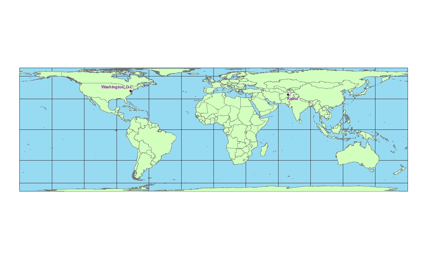
GCS_WGS_1984 has no distortion because everything is based on longitude and latitude: The distance between Washington, D.C. and Kabul was found to be 6,935 miles.

Conformal

Mercator projection: The distance between Washington, D.C. and Kabul was found to be 10,164 miles.


Gall Stereographic: The distance between Washington, D.C. and Kabul was found to be 7,166 miles.


Equidistant

Equidistant Conic: The distance between Washington, D.C. and Kabul was found to be 6,975 miles.


Equidistant Cylindrical: The distance between Washington, D.C. and Kabul was found to be 5,074 miles.


Equal Area

Bonne: The distance between Washington, D.C. and Kabul was found to be 6,706 miles.


Cylindrical Equal Area: The distance between Washington, D.C. and Kabul was found to be 10,695 miles.

The total layout


When a map of our round Earth is required, the most accurate representation is a three dimensional globe. However, a globe doesn’t always provide all the functionality needed in a map. It is therefore useful to be able to translate, or project, the Earth onto a flat surface like paper or digitally on a computer screen. Map projections are used to project the round Earth onto a flat surface. There are a variety of map projection types to choose from and which you choose depends on what parameters need to be the most accurate or to minimize distortion in a particular way. Examples of some parameters are distance, direction, shape, and area ratio. Three types of map projections will be discussed in the following paragraphs; these include Conformal, Equidistant, and Equal area map projections

A conformal projection maintains angular relationships and accurate shapes over small areas. It is used where angular relationships are important like with navigational or meteorological charts. The conformal maps that I chose to show are the Mercator and the Gall stereographic projections.. The sizes of areas are distorted on conformal maps even though shapes of small areas are shown correctly. A Mercator projection has straight rhumb lines, lines crossing all meridians of longitude at the same angle, which enables one to easily determine compass courses for marine navigation. Gall's stereographic cylindrical projection results from projecting the earth's surface from the equator onto a secant cylinder intersected by the globe at 45 degrees north and 45 degrees south. This projection moderately distorts distance, shape, direction, and area.

An equal area or equivalent projection maintains accurate relative sizes and is used where showing area accurately is important. Shapes are more or less distorted on every equal-area map. The equal area projections I chose to show are the Bonne and Cylindrical Equal Area Projections. The Bonne projection, shaped like a heart, is a pseudo-conical equal-area map projection that applies the true scale along the parallels of the Sinusoidal to the parallels of the Simple conic. It is used in atlases for equal-area maps.

An equidistant projection maintains accurate distances from the center of the projection or along given lines. It is used for radio and seismic mapping and for navigation. The equidistant map projections I chose to create are the Equidistant Cylindrical and Equidistant Conic projection. On an equidistant conic map, distances are true only along all meridians and along one or two standard parallels. Directions, shapes and areas are reasonably accurate, but distortion increases away from standard parallels.

Now that the different map projections have been discussed, without bias, their significance can now be fully explained. As has been explained in the above paragraphs every map projection has its own distortions. It is up to the creator and/or user of the map to decide which projection is best suited for a specific application. The example given in class was that if one wants to launch a missile from a given location, one should use an equidistant map with its center located at the launch site. This is because equidistant maps only preserve distance from a specific point to any point on the map, and not between two arbitrarily chosen points. If one were to choose a different type of map projection they would almost certainly not hit their target.

When studying the distance results one must not take the distances at face value. This is because if one were to use a map based on these result, they would be very disappointed. Based on the results the conic equidistant is the “best” at preserving the distance between it is the closest to the actual distance as was found from GCS_WGS_1984. However, this is very misleading because this map is not supposed to preserve the distance between these two locations because it is not centered about either one. Also the Bonne and Gall stereographic projections are fairly close to the actual distance, however, because of the distortions present they are still slightly off of the actual distance.

Also when looking at the maps one has to realize that many of them do not maintain correct area ratios. One of the worst is the Mercator projection. It distorts the poles so much that if someone who had never seen a map was told that this was what the world looked like they would get a very incorrect representation. So as has been said before, it is necessary to use these map projections as they are meant to be used.

In conclusion, there are an infinite number map projections that can be created and each comes with its own distortions. Map projections can be a very powerful tool but it is up to the user to choose the correct projection for their specific task. One may desire to use the map for navigation, distance, or representation. If one desired to it for navigation, or for any other purpose in which it was necessary to maintain the correct angular relationships then they would choose a conformal map projection. This map type is not concerned with preserving the distance or area. Two examples of this are the Mercator and Gall stereographic projections. If one was more concerned with preserving the distance from a point one should choose to use the equidistant map projection. The examples presented in this “report” are the Equidistant Conic, and Equidistant Cylindrical. In these maps it is not important to preserve the area or angular relationship. Finally if one wishes to keep the area ratio the same one should use an equal area map projection. This allows one to maintain proportionality and create maps that correctly portray the world. However, these maps should not be used for navigation or measuring purposes as they do not preserve angular or spatial relations. The examples presented are the Bonne and Cylindrical equal area map projections.

http://www.progonos.com/furuti/MapProj/Dither/CartProp/cartProp.html
http://egsc.usgs.gov/isb/pubs/MapProjections/projections.html
http://www.nationalatlas.gov/articles/mapping/a_projections.html
http://www.quadibloc.com/maps/mps0402.htm (Bonne)
http://www.quadibloc.com/maps/mcy0102.htm (Gall’s Stereographic)
http://www.colorado.edu/geography/gcraft/notes/mapproj/mapproj_f.html

Wednesday, May 4, 2011

Lab 4: ArcMap

Exercise #1 and #4

Exercise #2

Exercise #3

Final Layout


On my experience using ArcMap as well as the potential, and pitfalls of GIS.

When beginning this week’s lab I felt overwhelmed by the many options available to the user. Meaning that without a detailed guide I do not believe I would have been able to complete this assignment in a timely fashion. However, after doing the tutorial it was found that most tabs were relatively well symbolized which made it easier when attempting the tutorial for a second and third time. I found it exciting to finally apply what we had only talked about in lecture. This lab finally made me realize how powerful of a tool GIS can be when used correctly. Even though this lab only revealed the basics of GIS, I was still able to explore the data that was given to us. From this data I was able to create graphs as well as maps. The software also made it very easy to deal with different layers of data. A particular data layer could be brought to the surface simply by adjusting its position in the table of contents. Also the names of specific layers could be altered easily in the table of contents and they would update automatically in the legend of their respective map with no user input.

Overall this software is very user friendly and has many features built in other than simply displaying information from the geodatabase on a map. It has the capability of allowing one to place multiple maps, each containing many layers, onto one layout. This layout can then be printed in a variety of sizes depending on printer capability. Also built into the software are tools that allow the user to add headings and change the color schemes. These are very useful tools that can help one with creating a presentation. I took full advantage of these tools and produced a layout that is fairly different from the one provided at the end of the tutorial. I added a background color to the entire layout, changed many of the colors within each map, and changed the style of north arrow, and scale bar. Another thing that is different about my map is that the bar graph has 3-D bars that have a black outline so that the viewer can clearly see them. The final difference is that in order to make the proposed airport expansion zone clearer I created a new data frame and placed it inside, and labeled it accordingly. If I were presenting this information I would use this graphic to clarify if there were any confusion.

The one pitfall that I encountered when using this software was that when it asked you to find how to find number of parcels of land use within the noise contour as well as the total area of each type. When you found the area it did not tell you if the area it was presenting was just the area within the noise contour or if it included the area of the entire parcel even if only a small portion of that parcel was touching the contour. This could potentially be a major issue if this data was actually being used. If there is one small section of an extremely large farm that is within the noise contour and the entire area of that lot is used then the data will be highly skewed and thus will yield inaccurate results.

The potential applications of GIS’ are varied and diverse; useful for any application requiring spatial or geographical components. GIS can be used to store, analyze and present geographically referenced data. To see its potential one only has to look at some of its possible uses. For example predicting areas of high risk by combining census data and weather information to identify hurricane flood zones, a business can map out it sales geographically to capture a niche market or eliminate geographic areas with poor sales, or one can map the number of physicians per 1000 people to determine which geographic locations have adequate medical facilities and identify areas to attract new physicians. As the geodatabase is expanded, relating data in new and interesting ways is only limited one’s imagination. As I will discuss shortly this is also one of the pitfalls of GIS.

A pitfall of GIS is that it will always have issues with accuracy and precision because it is an abstraction of reality. This means that all entities are represented by geometric interpretations of them. These geometries include points, lines, and polygons which inherently make simplifications of reality. It becomes especially difficult to represent reality when trying to fully represent entities that are constantly changing. Examples of this are lakes or swamp land.

Another pitfall of GIS is that the data that is collected to be input into the geodatabase can potentially have errors in it. This could be due to a careless geographer collecting faulty data. These errors could also come about from faulty or inadequate methods and tools. Though the data is rigorously checked I’m sure that some of the errors make their way into the geodatabase. Also even if the data that gets entered in is correct there are still ways in which the user can again cause problems. These problems are allowed to occur because data interpretation is still in the hands of the user.

GIS is a powerful tool that when used correctly can produce very powerful results, however, in the wrong hands it can be used to produce results that are biased. Because GIS is very reputable, people are not as likely to question the results as they would be if the same results were presented using Neogeography.

http://www.gisinarchaeology.com/gis_pitfalls.php
http://info.med.yale.edu/eph/ycphp/newsletters/GIS_and_Preparedness.pdf
http://www.kralidis.ca/gis/project/GISmeta/
http://gis.com/content/what-can-you-do-gis